Discover the psychology of colors in branding and how the right color palette impacts your brand’s success. Xane Solutions reveals strategies to boost brand perception and customer engagement.
In today’s competitive business landscape, creating a brand that stands out requires more than a catchy logo or clever tagline. Every element of your brand conveys a message, and colors play a vital role in shaping perceptions, evoking emotions, and driving customer behavior.
At Xane Solutions, we understand that the psychology of colors in branding is a powerful tool that can either make or break your brand’s identity. This comprehensive guide dives deep into the science behind colors and provides actionable strategies for choosing the perfect palette that aligns with your business goals.
Why Color Matters in Branding
Colors are more than just aesthetic choices—they evoke specific emotions, influence decision-making, and affect brand recognition. Studies show that visual appearance drives up to 93% of a person’s first impression of a brand.
Key Reasons to Focus on Color Psychology:
- Emotional Impact: Colors trigger emotional responses.
- Brand Recognition: People recognize brands by color alone 80% of the time.
- Consumer Behavior: Up to 85% of consumers say color is a primary reason for why they purchase a product.
Understanding Color Psychology
Color psychology is the study of how colors affect human behavior and emotions. Each color communicates a unique message that impacts perception.
Common Color Associations:
- Red: Energy, passion, urgency (often used in sales and clearance promotions).
- Blue: Trust, calmness, professionalism (ideal for corporate or tech companies).
- Green: Health, growth, tranquility (great for eco-friendly and financial brands).
- Yellow: Optimism, warmth, attention-grabbing (used for cheerful, playful brands).
- Orange: Creativity, friendliness, enthusiasm (effective for call-to-action buttons).
- Purple: Luxury, wisdom, imagination (common in beauty or high-end brands).
- Black: Sophistication, power, elegance (luxury products, high-end services).
- White: Simplicity, cleanliness, purity (healthcare, minimalist brands).
The Role of Colors in Brand Identity
A well-chosen color palette reinforces brand messaging and helps build trust with your audience. It’s not about using random colors—it’s about strategic alignment.
Real-World Examples:
- Coca-Cola’s Red: Evokes energy, excitement, and passion, aligning with its youthful and vibrant brand positioning.
- Facebook’s Blue: Symbolizes trust, communication, and reliability, suitable for a social networking platform.
- Starbucks’ Green: Reflects growth, sustainability, and relaxation, reinforcing their commitment to environmentally friendly practices.
At Xane Solutions, we analyze your brand’s values, target audience, and market positioning to recommend a color palette that amplifies your identity.
How to Choose the Right Color Palette for Your Brand
1. Define Your Brand Personality
Your brand’s personality dictates which colors resonate best. Are you fun and playful, serious and professional, or eco-conscious and innovative?
- Playful Brands: Bright colors like yellow and orange.
- Professional Brands: Blue and gray tones.
- Eco-Friendly Brands: Green and earthy tones.
2. Understand Your Audience
Who are you targeting? Millennials may prefer vibrant and bold colors, while older demographics may respond better to classic and subdued palettes.
3. Analyze Competitors
Don’t just follow trends—study competitors. If all your competitors use blue, standing out might mean using a different yet relevant color.
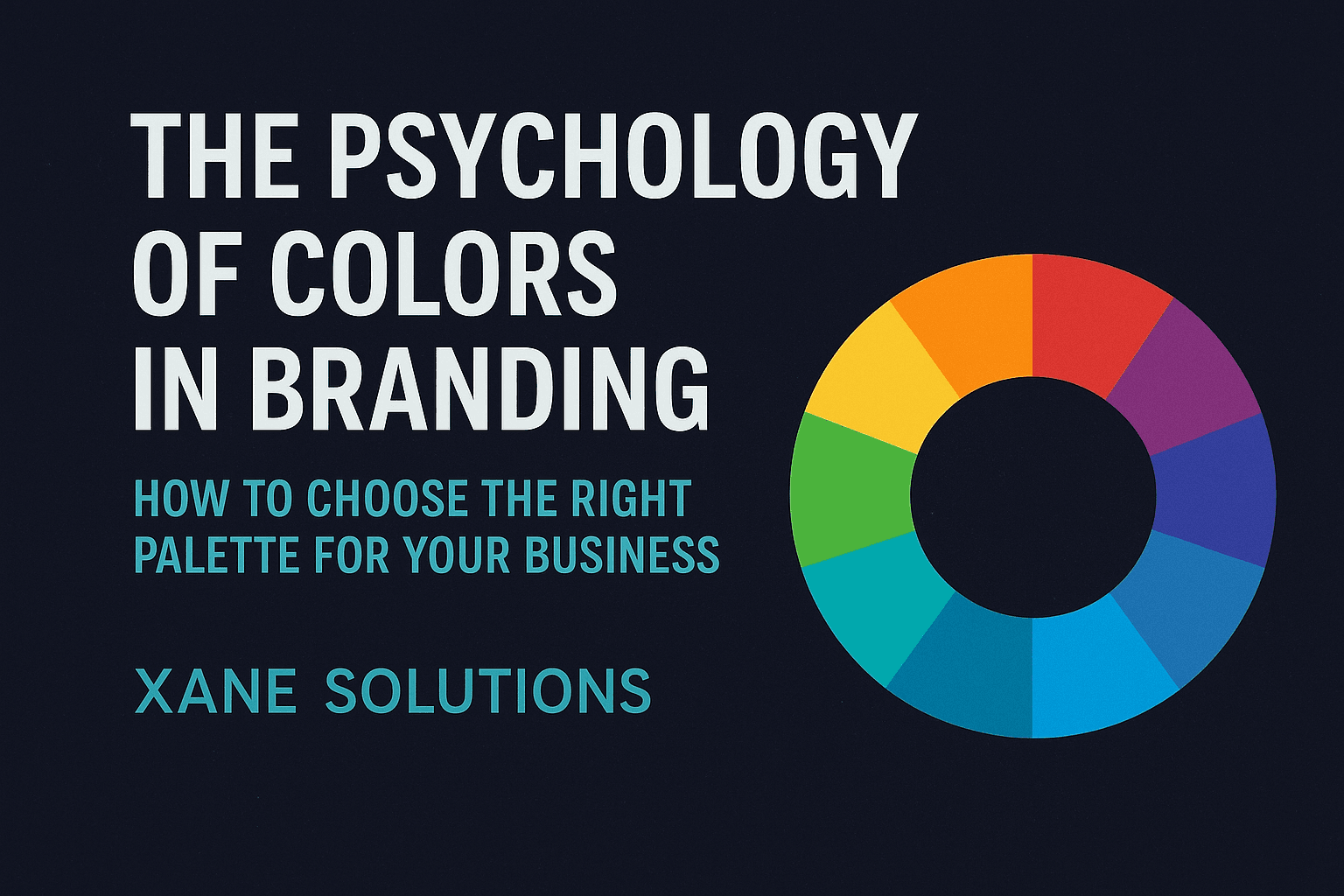
4. Utilize Color Harmonies
Use color theory to build a balanced palette:
- Complementary Colors: Opposite on the color wheel (e.g., blue and orange).
- Analogous Colors: Next to each other on the wheel (e.g., blue, teal, and green).
- Triadic Colors: Three evenly spaced colors (e.g., red, blue, and yellow).
5. Test and Iterate
Implement A/B tests to see how different color schemes perform on websites, ads, and social channels. Use analytics to optimize based on engagement.
The Impact of Color on Marketing and Sales
Colors don’t just represent your brand—they influence customer behavior directly.
Conversion Rates & Color Psychology:
- Red call-to-action buttons can create urgency, increasing clicks.
- Blue backgrounds tend to establish trust, boosting time-on-site.
- Green accents are often used in eco-friendly product marketing to emphasize sustainability.
Psychological Studies:
- People make subconscious judgments about products within 90 seconds of viewing them. Up to 62%-90% of that judgment is based on color alone.
Common Color Mistakes Entrepreneurs Make
Mistake 1: Following Trends Blindly
Using trendy colors without considering brand identity leads to disjointed messaging.
Mistake 2: Overcomplicating Palettes
Too many colors confuse customers. Aim for 2-3 primary colors and supporting shades.
Mistake 3: Ignoring Accessibility
Poor contrast or color combinations reduce readability, harming user experience. Always prioritize accessibility (WCAG guidelines).
Mistake 4: Inconsistency Across Platforms
Your color palette must remain consistent across your website, social media, packaging, and advertising for a cohesive brand presence.
At Xane Solutions, we ensure consistency in brand design and maintain color harmony to deliver strong, recognizable visual identities.
Leveraging Color in Digital Marketing
Website Design:
- Use color strategically for navigation, call-to-action buttons, and trust-building elements.
- Ensure brand colors enhance UX and reinforce brand messaging.
Social Media:
- Maintain a consistent color theme across posts.
- Use branded templates to create visual uniformity.
Paid Advertising:
- Apply color psychology to ad creatives—red for urgency, blue for trust, green for sustainability.
- Test different color schemes to see which yields higher CTRs.
Future Trends in Color Psychology for Branding
Dark Mode Popularity:
With dark mode becoming mainstream, brands are adapting color palettes that are visually comfortable in low-light environments without losing identity.
Dynamic Branding:
Brands are experimenting with adaptive color schemes that change based on time of day, user preferences, or contextual factors.
Sustainability Focus:
Earth tones and green-based palettes continue to gain traction as consumers prioritize eco-conscious brands.
At Xane Solutions, we stay ahead of these trends, ensuring your brand’s color strategy evolves with consumer behavior and technology shifts.
Why Choose Xane Solutions for Your Branding Needs
At Xane Solutions, we don’t just help you pick colors—we help you create a brand experience that connects deeply with your audience.
Our Services Include:
- Brand Strategy & Positioning
- Logo Design & Visual Identity
- Digital Marketing & SEO
- UX/UI Design
- Content Creation
Let us powerfully transform your brand into a market leader by leveraging the science of colors.
Final Thoughts: Make Color Your Brand’s Superpower
The right color palette is more than decoration—it’s a strategic asset that shapes perceptions, builds trust, and drives action. Avoid the pitfalls of random color choices and partner with Xane Solutions to craft a powerful visual identity based on proven color psychology strategies.
🚀 Ready to make your brand unforgettable?
👉 Contact Xane Solutions now for expert guidance.